Pages

Friday, November 12, 2021

1.2 Art

 In art, we have been working on our portfolios. My Kaupapa is about Filipino Culture but it is mostly focused on the folk tale story of the Bakunawa(A sea serpent). 

 I have finished working on my first board and am now working on my second board which is almost done. 

I chose this theme because I wanted to do something with my culture and its traditions. Choosing this theme also made me research and learn more about the Philipines, like the use of the old writing system Baybayin, which was what the characters of our alphabet looked like before the Philippines was colonized. 

My artist models are Robyn Kahukiwa and several ukiyo-e artists like Hokusai. 


This first still life is a drawing of my brother's water bottle. I sketched this with a normal lead pencil in our living room in the afternoon. 


The second still life sketch is a Pop figure of the 
Pixar character Alberto, who is a sea monster. I drew him with a normal lead pencil in my room beside my window where there was light seeping through.  


This last still life is drawn using charcoal which was referenced from an image online. I have to admit that charcoal was a medium I have never used before so this was an experience but it was fun to work with. I liked how easy you can blend with it. ( this has nothing to do with my kaupapa but I thought I should put this here too) 

Reference


This is my first board. Which consists of different media. Painting, Digital art, and printmaking(the moons in the last panel). The whole thing about this board is about the Bakunawa eating the moons. I tried not to add too many details and keep everything flat to replicate the ukiyo-e style. 


Tuesday, November 2, 2021

PPP

  For PPP Lauren and I collaborated on making a short comic for her story, "Intention" For about five weeks in three periods each. PPP is 3 hours a week we can do our own learning for our passions and interests. 

It went well but we didn't get to the interesting part as there wasn't enough time also I am very slow at drawing. 


Monday, September 27, 2021

Plan for Panel 2


Monday, August 2, 2021

Pathos,Logos, Ethos

In English, We are learning about persuasive writing and currently learning about the three persuasive writing techniques. Pathos, Ethos and Logos. We are doing this to enhance our persuasive writing so that we can appeal to the audience more. 

 We are learning about  Pathos, which translates suffering, experience or emotion from greek is a technique that is used to convince an audience through emotions. It is used to persuade the person to feel emphatic, making you feel emotions. For instance, an animal or a child is usually in posters or ads to make the audience feel emphatic. An example of this is in this poster. They used a child so that it'll have more impact. Just looking at this poster makes you think who in their right mind would give a child smoking but then if you read it further into it's a go vegan type of ad. They've used a child to show that eating meat is as bad as smoking and how you shouldn't feed a child meat. 

( I don't agree with this though) 


Ethos, Pathos, Logos - Media Analysis


Ethos, which translates to custom or character from greek,  it is a type of writing that the writer uses where they credit themselves so the audience/customer can trust that the product or what they're trying to persuade can be trusted. It is used to convince the audience through authority and credibility. For instance, if a writer says that they've been writing for years, you'd assume that they're a really good writer and you might even consider buying one of their books. An example of the use of Ethos is in this ad where they've put " #1 band recommended by dentists" which shows us that dentists - the people who are the ones who diagnose and treat people who have oral problems- approve of this which means people would buy this as professionals put trust in this product. 

Fallacies in Advertisement – ningeunice


Logos, which means logic. This is where statistics, data, facts,  numbers and etc. is used. It is used in persuading the audience with logic and reason to appeal to them. For instance, in food ads, they'd put the amount of fat, carbs or sugar which are usually very low which makes the audience want to buy the product as they'd think they won't gain as much weight. Another example of Logos is this poster, They've used the new features of the product to appeal to the audience and to show how it is better than all the other phones. The use of numbers is very effective too. 

Ethos, Pathos & Logos: Definition and Examples of Persuasive Advertising  Techniques (2021)


Monday, May 17, 2021

AS 90913 v4 internal assessment 4 credits - Literacy blog post 5

 What connections can you make between the two Artists Kaupapa and the use of text and image?

Tracey Tawhiao and Robyn Kahukiwa have similar kaupapa as they both are Maori so they represent their culture in their artwork. They use text and images to further enhance and send a clearer message by adding words to images. Since Maori culture isn't represented so well in the media, these artists represent their culture


Robyn Kahukiwa's artworks are more focused on the past and mostly focusing on feminism while Tracey Tawhiao's artworks are focused on the present and use subversion to show how the media treats Maori and Pacifica, people.


Robyn Kahukiwa | Te Ha o Hineahuone (2018) | Artsy
An example of Robyn Kahukiwas artwork. Here she has painted 6 women and used a very monotoned colour palette with greens, yellows and reds.

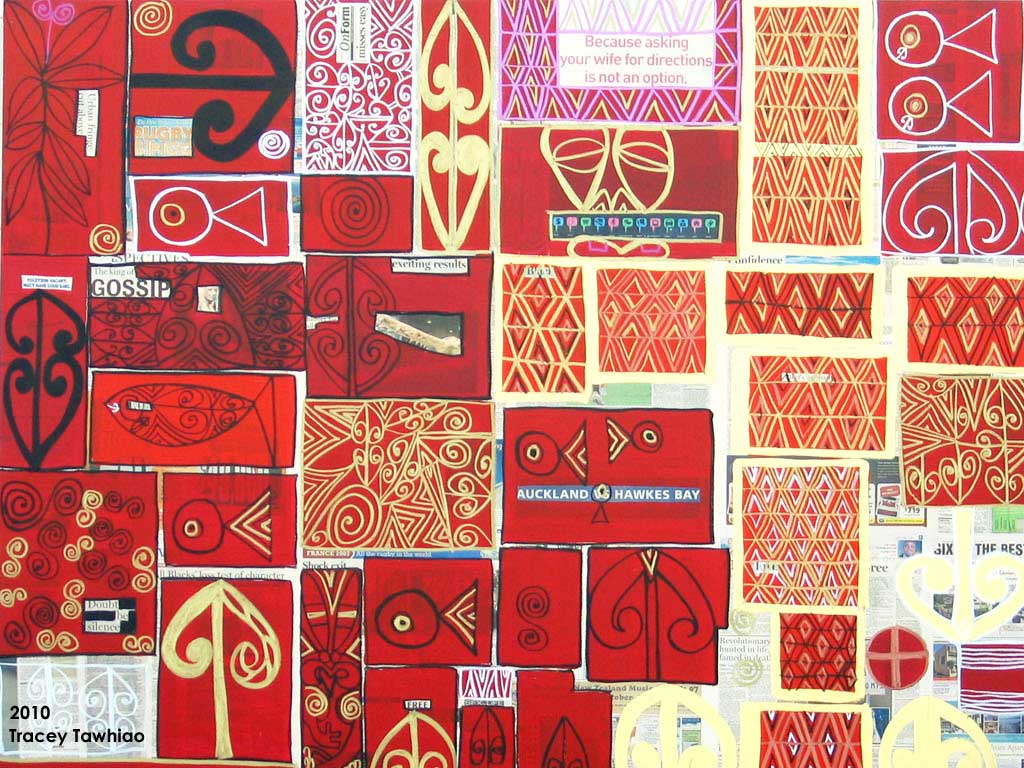
Tracey Tawhiao — ARTIVIST : creative by any means necessary!

This is Tracey Tawhiaos artwork where she uses different tones of red and used a lot of grids with symbols: fishes, korus, triangles and diamonds.


Wednesday, May 12, 2021

Art - Series and Sequences

 In art, we have been thinking of our Kaupapa and how we are going to layout our art portfolios. 


For this activity, we are to point out what belongs as a series of work that stands alone by itself. Our teacher taught us that we can look at our portfolios like an essay; the first few parts are the introduction, the body and then the last image could be the link to another paragraph which is the second part of the portfolio. 


Thursday, April 15, 2021

My Reflection

In the Kete Celebrating Cultures, I created a static image digitally about my Filipino culture. 

I first drew my draft on paper and then drew it digitally after.

I got the idea of putting the buffalo and the eagle because they are the national animals of the Philippines. Then I got the idea to put baybayin because it was the old letters used when the Spanish haven't colonized the Philippines. I got the idea to put the sun rays on her head from an image I saw online. I stuck with the colour pallet of the Philippines flag and the design of her clothes like the stars which represent the 3 major islands of the Philippines. I got the idea of the pearls on her hair, neck and hands from the quote "Perlas ng Silanganan" or "Pearl of the East". The quote is from the Philippine national anthem. 

I worked well. Although there were a lot of things I wasn't satisfied with, I am pretty satisfied with it. 


Rink Kawauchi inspired


This week in art we took pictures outside using the cameras provided by the teacher. Rinko Kawauchi inspired our Photography, and these are the images I referred to while taking pictures. 


Worlds apart: who has the best shot at winning the Deutsche Börse prize? |  Art and design | The Guardian

Just to refresh the mind: Rinko Kawauchi Flowers


We used Photoshop for editing our pictures.  I stuck with the tints of pastel pink and blues because Rinko Kawauchi uses these colours a lot in her photography. I also took close-ups of different objects to replicate how she takes her pictures. I added my own hints to it like adding a white vignette on the side and some clarity so that the image looks softer. 


Wednesday, April 7, 2021

WALT: Analyse how film aspect colour in film, production design, POV and POT, and visual motifs shows meaning in film. 


Success Criteria : I am able to explain how colour in film, production design, POV and POT, and visual motifs are used to show meaning. 


How did it go? : I was able to understand that colour in film, production design, POV and POT, and visual motifs are used to show meaning in film.


https://prezi.com/p/edit/0ycdi_oonfb6/

Thursday, April 1, 2021

Robyn Kahukiwa AS 90913 v4 internal assessment Blog 4

Barbara Kruger 

https://www.nga.gov/education/teachers/lessons-activities/modern-art/text-art.html


Barbara Kruger made her own art in 1969 while writing poetry, film and television reviews. Later, she had developed her "picture practice" with photographs repurposed from vintage manuals and magazines, which she had overlaid with her own texts or commonplace phrases. 

She places her statements and questions over the images to confront the idea of representation. 


Describe the artwork:

This artwork shows a statue facing away from us with a black background. 

 The light symbolizes the word gaze hitting the statue's face. 

 The focal point is the face 

The words say "Your gaze hits the side of my face"

In my interpretation, Barbara Kruger used this image to show the male gaze. The statue is representing a woman and the light is the man gazing at the statues face. 

Barbara Kruger shows text and image working together through adding text on an image and making it a different meaning through adding text and gives us a unique perspective than what the actual object was meant to portray. She uses black and white images and provoking words in white and red. 

The art scene was male-dominated before and women artists were often rejected at exhibitions because of their gender which she thought had to be changed. Through her artwork, she can express her statements to gain equality. 

compared to Tracey Tawhiao's artworks, she shows the themes of feminism subtly as with words and symbols in her grids. Every panel has a meaning and is intentional. 

Tuesday, March 30, 2021

Robyn Kahukiwa AS 90913 v4 internal assessment Blog 3

 Tracey Tawhiao 

https://redartgallery.com/collections/tracey-tawhaio


Tracey Tawhiao is an artist with a wide range of artistic abilities: poetry, painting, performance and filmmaking. She is known for using newspapers as the base of her artworks. She layers on top blocks of colours and Maori symbols and separates them into grids. 


Text and Image are demonstrated in this artwork through the only word in the whole artwork "SPRING" and the blues and pinks that give off a very peaceful and positive vibe. Because of the word Spring, the entire image's meaning got clearer. She used two korus hanging of a stem symbolizing new life and new beginnings just as how spring is symbolized that way.

The text helped me understand the image more because, without the word "SPRING" in the image, I would've had a different perspective towards it and interpreted it in another way. Without the text, I would've interpreted it differently.

Tracey Tawhiao's artworks are separated into grids and mostly consists of unique patterns with mostly korus and fishes, while Robyn Kahukiwa's artworks consist of one image with one or multiple people 


Robyn Kahukiwa paints humans while Tracey Tawhiao doesn't

Tracey Tawhiao's paintings are flat while Robyn's aren't. 

Robyn's colour choices are very dark while Tracey's are a lot more vibrant.

Wednesday, March 24, 2021

AS 90913: Robyn Kahukiwa Text and Image - Blog Post 2


How does the arrangement help the story?

In this artwork, the color scheme she uses is dark green, yellow, brown, and dark red. These colors kind of give you an uncomfortable feeling along with the women with empty staring eyes and titled heads resembling a hei tiki. But one of them is facing away from the audience. She looks like she's resting or perhaps in pain of bearing the child. 

What does Robyn Kahukiwa have to say about being a woman and being Maori in her artwork?


As Robyn Kahukiwa was born in Australia, she lost her connection with her family and culture until she was 19 and returned to New Zealand. She then rediscovers her Maori heritage. She creates artwork that is mostly about Maori women's empowerment. As women in the media are misportrayed, She paints backgrounds of stormy skies, lava eruptions, and puddles that resemble blood behind Maori women who would usually wear feathers symbolizing leadership and standing up tall and staring straight at the audience. She also often paints women who are pregnant showing that women are the start of life.


The difference between realism and stylization of figures. How does Kahukiwas's style reflect this?


As I have mentioned before, Robyn Kahukiwa draws some women in her paintings head tilting resembling the hei tiki. Other New Zealand artists influenced her works like Colin McCahon, we can see his influence on Robyn Kahukiwa's work from the way she paints some of her backgrounds and Ralph Hotere, where we can see his influence through her color choice and how she conveys her messages through her paintings. Another artist which influenced her art from Mexico named Frida Kahlo. Frida Kahlo paints her portraits always staring at the audience without expressions and staying still with no dynamic movements. Through the influence of these artists, Robyn is able to stylize her works creating her own reality. If the art style used was realism, I personally think it would give more impact but you will get too lost in the details of the face instead of looking at the whole picture. The stylization helps with understanding the meaning of the image even though the figures don't have any expression, it still looks dynamic.


Monday, March 22, 2021

Tracey Tawhiao

 In art, we have been looking at different Maori artists. We painted artworks in reference to Tracey Tawhiao's art. She is famous for her subversive artworks made of newspaper with controversial ideas. She paints over the long paragraphs creating grids to overlay various patterns. We then replicated her technique by first picking a subject out of a newspaper by highlighting words.

 I chose battle and justice, then a sentence "Life has changed for us already". Then block out the newspaper's paragraphs with white paint and then layering them with the two colors I chose. Red and Orange. I surrounded the word battle with red because it represents bloodshed.  

Below that, I painted a musket and patu to represent the musket wars among Maori between 1807 and 1837.

"The Life has changed for us already" Which is surrounded by korus which represents life. 

I then painted a lady which is inspired by another Maori artist named Robyn Kahukiwa. I replicated the flat style and the way she draws her figures tilting their heads resembling the hei tiki, then painted a red circle behind her that I smudged a bit to blend with the background. 

I then surrounded the word justice with feathers that symbolize the Parihaka where children and women wore feathers on their heads as peaceful resistance to keep their land from being invaded. Below are weights that represent justice. 

On two of the orange blocks, I painted triangles with black, white, and red paint that represent mountains.


Friday, March 19, 2021

 In Wananga, we have been working on some of the tasks from Ms. Mclarens site about International Women's Day. 


For one of the tasks, I made a poster based on the fact sheet in celebrating IWD for 100 years.


Thursday, March 18, 2021

Wananga- Kai

 This week, the Ka Ora Ka Ako started where we are served food to eat for 15 minutes. We rearranged our tables so that our class could eat as a family. At first, It was really weird how when we are sitting in the new table arrangement, we are facing another person in front of us. Someone who I was not familiar with and it made me feel uncomfortable, but as we kept doing it every day, It still felt uncomfortable but not as uncomfortable as the first time. 


 Today we were served a Sandwich, a slice and a banana. I liked the banana because the fruits are cool. Tomorrow we will have The Brown rice Buddha bowl with slaw and either chicken tenderloins or falafel. 


Wednesday, March 3, 2021

AS 90913: Robyn Kahukiwa Text and Image - Blog Post 1

  Text And Image Source

1.  "Throughout history, written words have been combined with visual images in a form which ranges from the explanatory to the enigmatic, from the constructive to the contradictory, from the iconic to the irreverent, and so on." -  Leslie Ross

Medieval illustrated manuscripts, in all their variant forms, often exhibit extremely creative and close associations of words and pictures." - Leslie Ross

"texts and pictures and it becomes quite clear that the basic concepts and possibilities for text/image combinations really have a great deal of continuity even though many people might not immediately make these types of connections." - Leslie Ross


Text and image combined have been used for a very long time. 


Robyn Kahukiwa uses text in images to enhance her artwork. If the text wasn't there then the whole meaning of the image would change. Without the text, we would think that this is just another painting staring at you but the words make the image look more impactful especially that it is in Maori since it is her culture. 

The image shows a woman who is wearing a blue garment and a headpiece in the shape of a koru. She also has a baby in her stomach so this shows that this woman is a mother. The red background contrasts with the blue garments that the mother is wearing which make her pop out of the image. The focal point in the image is also the face since it has the most details in the artwork. 

According to google translate, "he tapu te tinana whahine o te whare na te mea tangata te" means "the female body of the house is sacred because it is human"


 Tangata Whenua meaning People of the land. This image demonstrates Text and Image well with the black background making the white text pop out. The text is also repeated a bunch of times " Tangata Whenua" translated to  "People of the Land" to remind us and to not forget.  At the centre of the image, there is an image of a Maori person and their hair surrounding items which represents their culture and text labelling them. 

Monday, March 1, 2021

Notes To Self

Note to self is a book with quotes that talks about feelings and emotions. We have been doing this for 2 weeks in our Wananga class.


Monday, February 22, 2021

Tracey Tawhiao AS 90913 v4 internal assessment

 Subversion

 Subversion in art is something controversial and it's supposed to make you feel offended in some way. Subversion art also makes you change your perspective on how you look at the world. Taking Tracey Tawhiao's art as an example, she creates her art from newspaper and takes key words from it. She then leaves the words out and paint over the rest. With the words left, it creates a whole new different meaning that was not intended in the newpaper. 

 It is called all share space. The color pallet is mostly blue, gold, and white. I think this image was made at the start of covid. From what I can observe, the fishes has triangle patterns and I think they represent masks.


From my understanding, subversion is represented through the words that are shown. "It's what they didn't say told the story." It's about the mistranslations in the Treaty of Waitangi and the outcomes of it. "ownerships"or "kawanatanga".

Friday, February 19, 2021

Wananga

 My understanding of the Treaty of Waitangi is that it is signed in the 1840s. It is an agreement between the Crown and some Maori leaders. It has 3 principles: protection, partnership, and participation. There were a lot of mistranslations in the Maori version 


https://nzhistory.govt.nz/politics/treaty-of-waitangi


 This week in Wananga, We did our Wananga introduction slides and wrote in our journals.  


What I think of Wananga is that it's okay since I am not really sure what it's for.  


Note to Self is a book full of inspirational quotes. It is very cool. 


Wednesday, February 17, 2021

 In art, we referenced some of Tracy Tawhiao's artworks. 


I think the focal point of the second artwork is the horse. Because its the only one that looks different and it isn't repeated, unlike the other patterns.

For the top image I think the focal point is 
the koru that shaped like an arrow is the focal point. It's because I heavly shaded it in and it pops out the white image.


Monday, February 15, 2021

Subject matter matter


In art, we differentiated the differences of the different paintings of the artists with the same themes and subject matters. 

Moodboard

Last week in art our class made a mood board consisting of different artists. The theme I stuck with is the color red.


Plan

This week in arts we brainstormed a bunch of ideas. I couldn't come up with any ideas about the cityscape subject.

I am also pretty interested in the ukiyo-e artstyle